
Smith & Nephew is the global leader in advanced wound management and found competitors were duping their packaging in an attempt to fool customers. Therefore, S&N wanted their direct-to-consumer packaging to stand out amongst the competition.
This premium range of plasters and dressings have advanced healing technology to help wounds heal faster and prevent scarring. As a well-known international company there were many challenges faced in terms of pushing the boundaries with design, whilst adhering to their corporate identity.
Amanda conceptualised, art directed, and designed the new-look packaging, created the illustrations which appear on each pack and created consumer-friendly copy. She was also tasked with creating print adverts and point-of-sale material to promote this new look.
CONSUMER-CENTRIC + USER-FRIENDLY
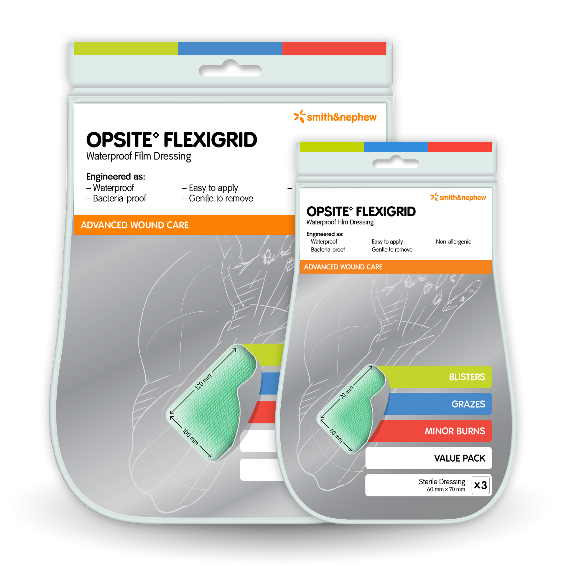
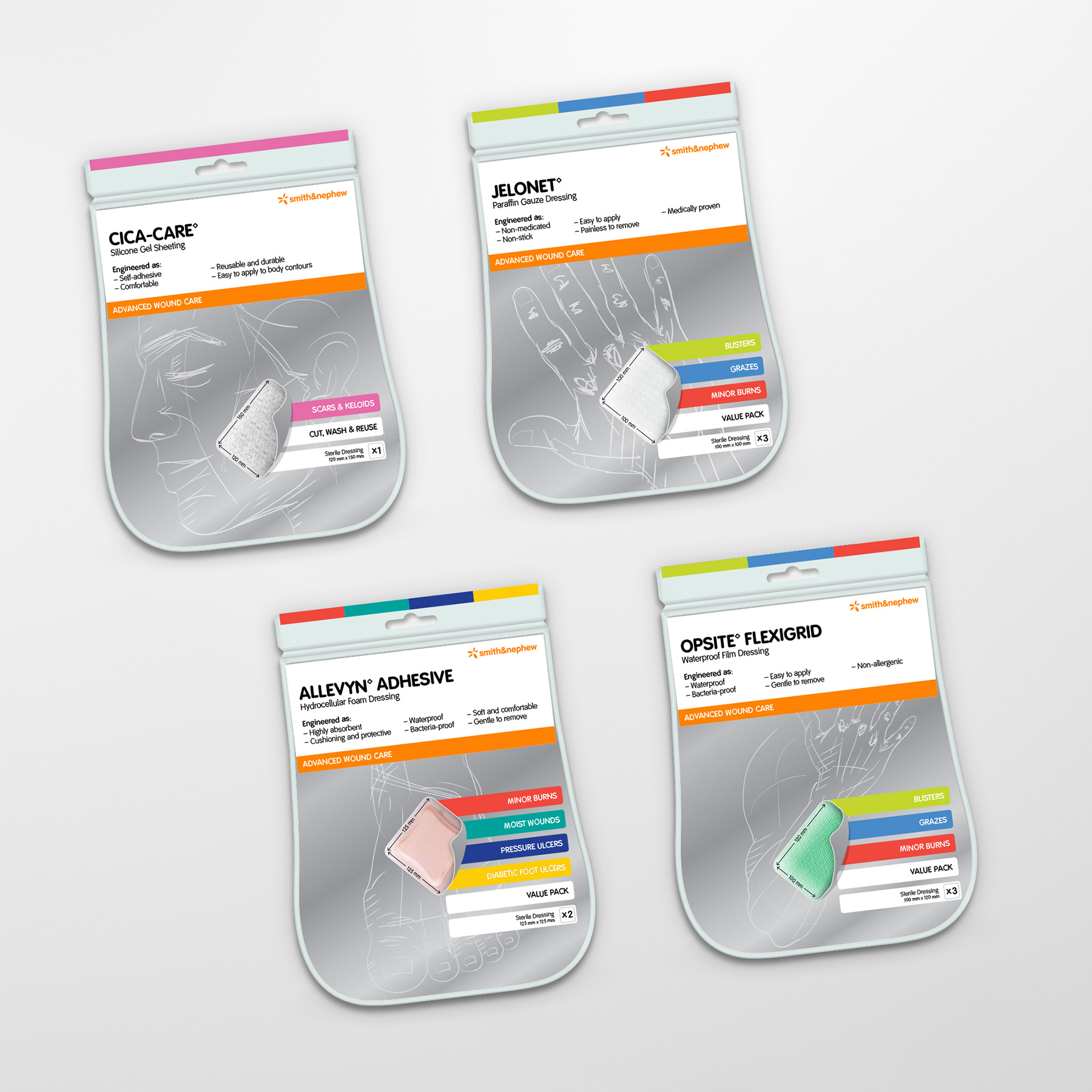
The imagery displays where the product can be used on the body, whilst the colourful tabs indicate what it can be used for. The coloured tabs correspond to a colour system which makes it easy to find the relevant products on-shelf.
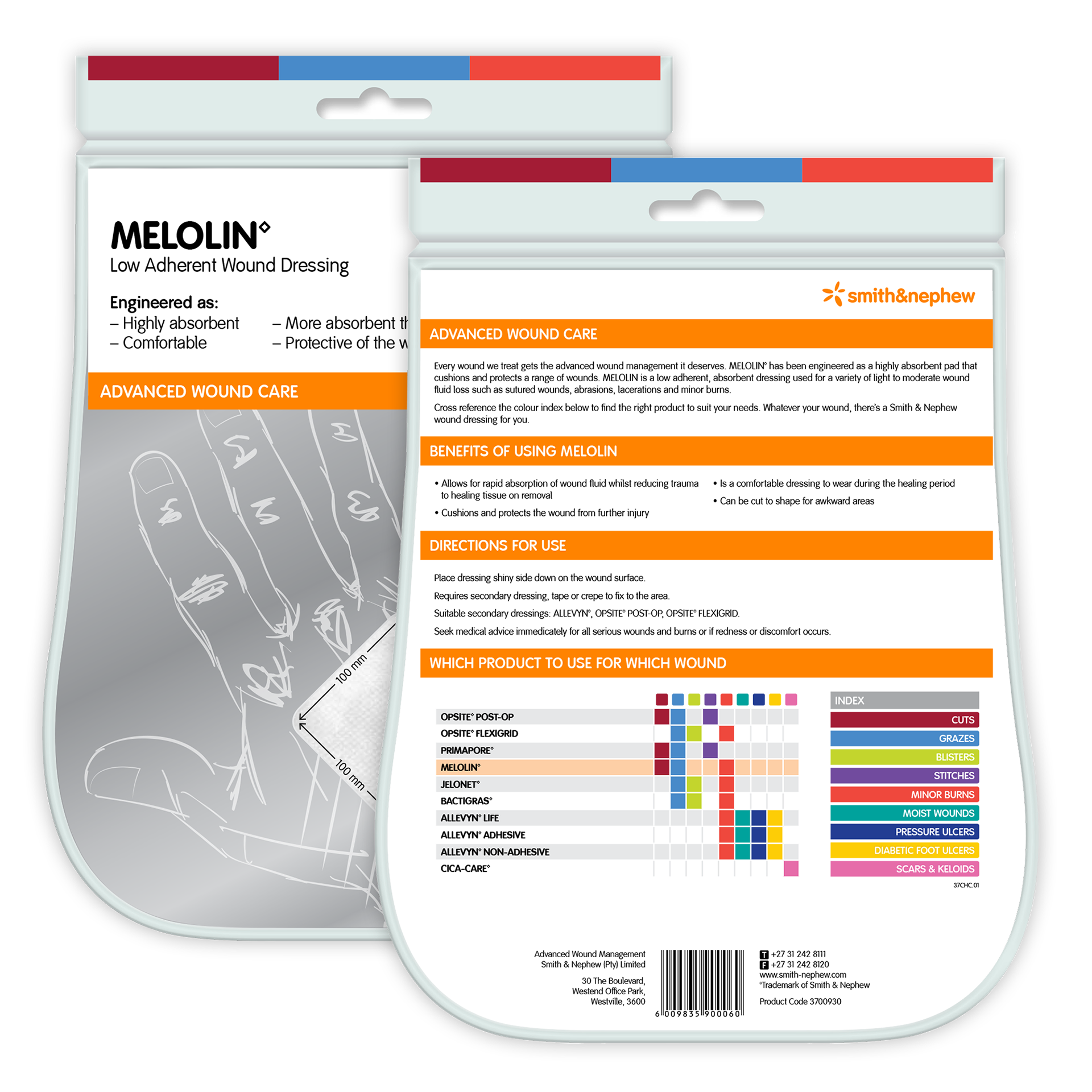
UNIQUE SHAPE + ILLUSTRATIONS
Inspired by Leonardo da Vinci (a man before his time), the organic shape and imagery implies human touch and care. The mirrored inner card indicates a premium product with added value, and makes the packaging inclusive of all race by reflecting the consumer’s own skin colour.
This was key for an global product which needed to appeal to people of all colours.
BEFORE + AFTER COMPARISON
The end result is an innovative, modern and futuristic design which is aesthetically pleasing, stands out clearly in-store and is adaptable for use across the entire range.
